Ravelry: Design System
Ravelry launched in 2007 for a small community of knitters and crocheters, but over the next decade in grew exponentially: hundreds of thousands of patterns were added to the database, millions of users joined, and an uncountable number of features were added at those users’ request. By the time I joined in 2018, the site’s architecture was growing unwieldy. New users found it difficult to navigate, it wasn’t up to modern accessibility standards, and virtually none of the pages were responsive for mobile devices. There had never been a designer on staff before, so I rolled up my sleeves and got to work on creating a design system.


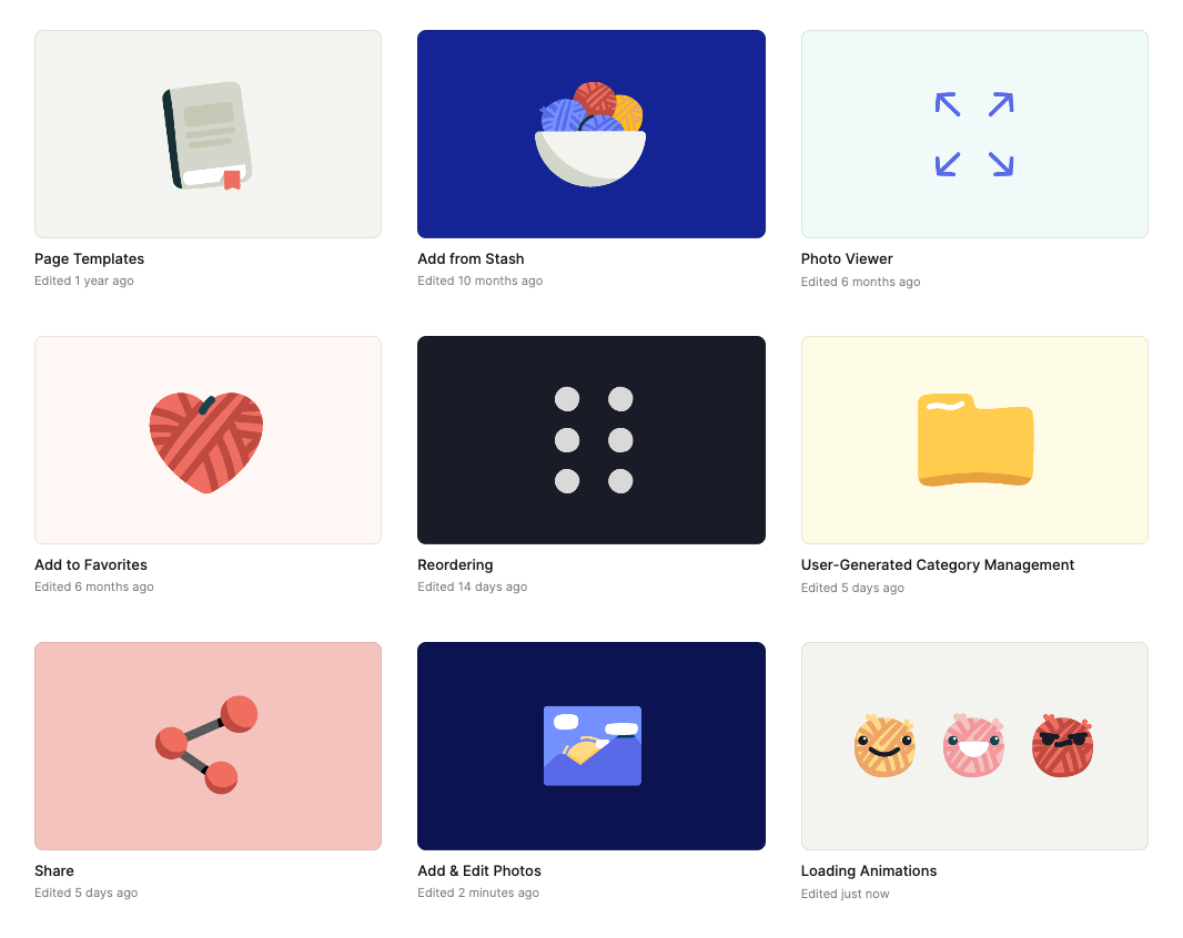
Master components in the Ravelry design system library
I often use this metaphor: Ravelry was like a huge hotel (think Mohonk Mountain House) that had started as a little bed and breakfast, but was now a sprawling resort with dozens of mismatched additions. New users were getting lost in the hallways (if they came in through the main entrance at all), no one could find anything in the various disconnected libraries, and you couldn’t book a room from your phone. The light switches and faucets worked completely differently depending on whether you were in the east wing or west wing.
My task was to disassemble the entire hotel, reorganize the pieces, and use them to rebuild the site—but I couldn’t change the basic layout so much that the regular guests wouldn’t be able to find the front desk anymore.
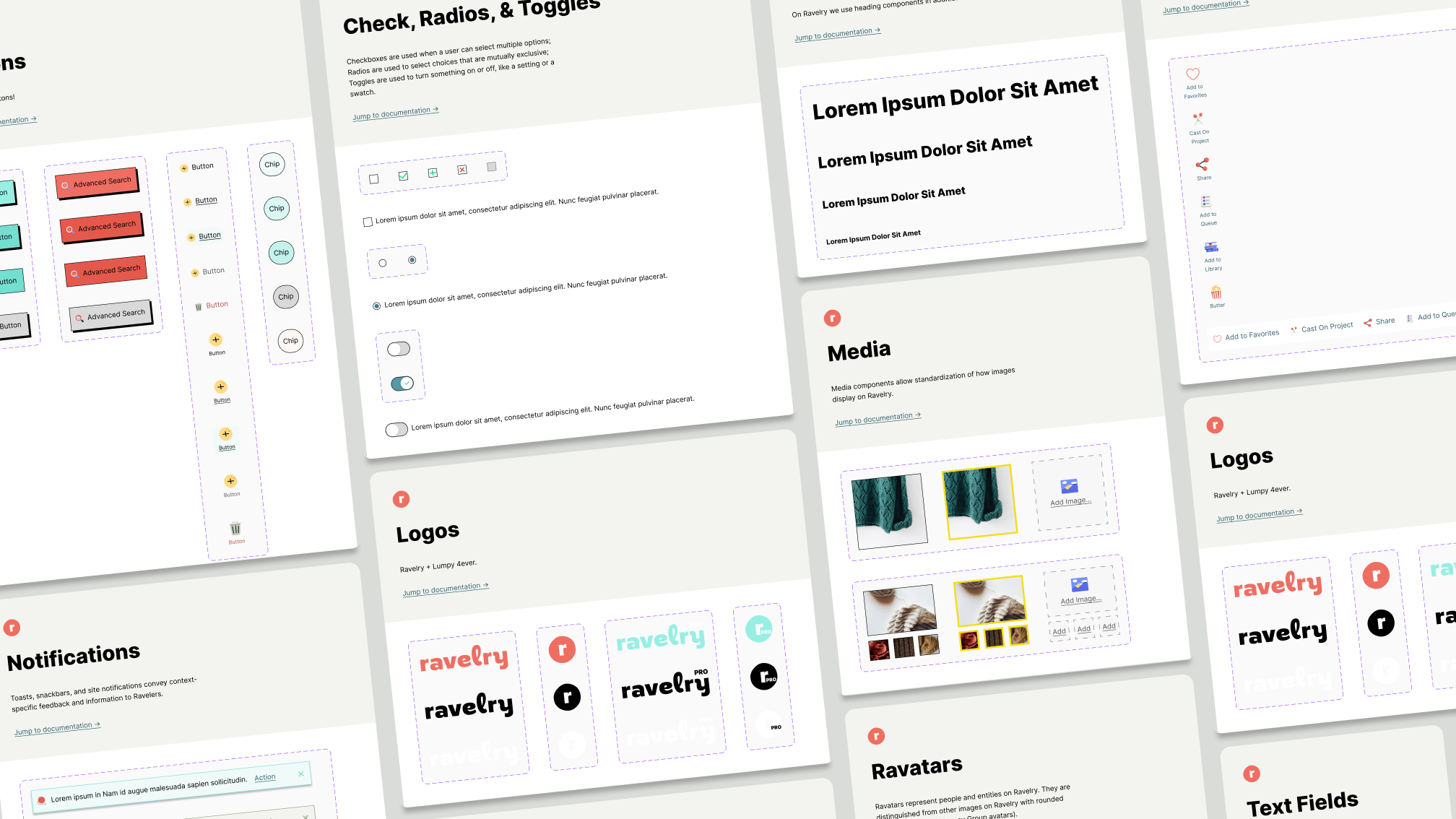
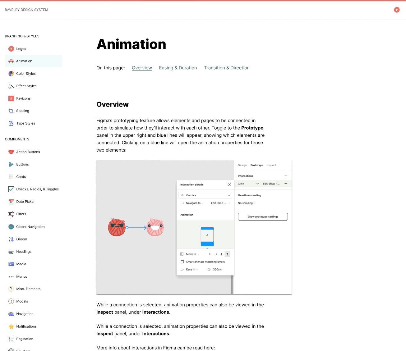
In addition to the component library, I created several files that standardized common UX patterns. Previously, these functions might have worked several different ways depending on where a user was on the site. Check out a prototype example here.
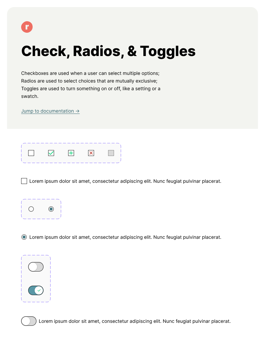
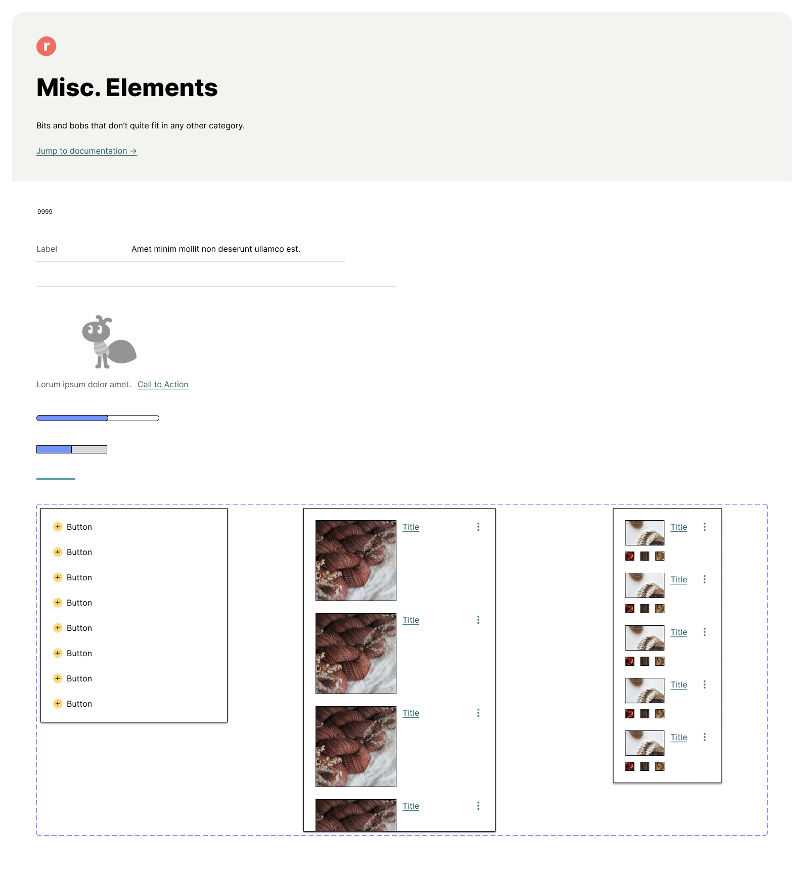
I documented every existing UI element, larger UX pattern, and page template. Then I applied our new branding. Somewhere in there the world switched from Sketch to Figma, so I migrated everything over. I organized and documented, nested components and refactored variants, standardized cards and photo uploading journeys and filtering UIs and global navigation. I made everything adjustable for mobile/tablet.
When the component library was done, I created documentation for our team and any future Ravelry designers.
The design system is built in Figma, using their component library files. Since I finished it, I haven’t changed it much — the components, patterns, and page templates in the design system are usually everything I need to build a new feature.
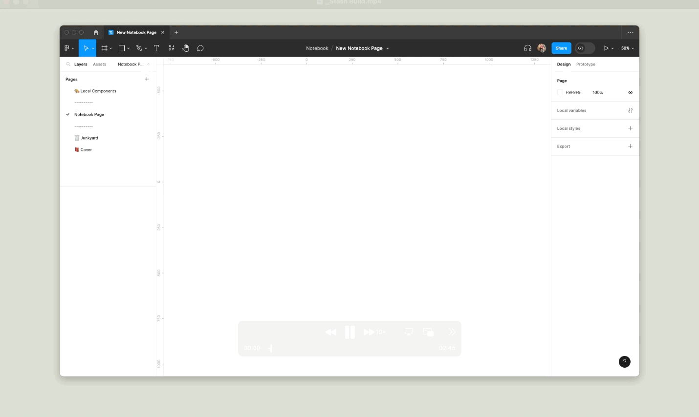
The “Lego pieces” in my component library makes it quick and easy to mock up interfaces (although, okay, I confess, this is a little sped up 😉).
After we launched the redesign, we received feedback from some users that they wanted a dark theme and a lower-contrast version of the light theme. Our most vocal users also tend to be longtime power users, so I created a quantitative survey to collect feedback from a wider range of perspectives. The survey was taken by over 10,000 Ravelers. I used the results to design our “Herdwick” and “Balwen” themes.

My design system library files in Figma for our 3 modes. You can view them in my community Figma here: figma.com/@livianelson
To create our new modes, I cloned our global design library file, then translated the color and effects styles for each mode. Certain elements—like our illustrated icon set—had to be meticulously recolored one at a time to work with the respective modes (for example, the women in the light mode “friends” icon became white-haired grannies in dark mode).


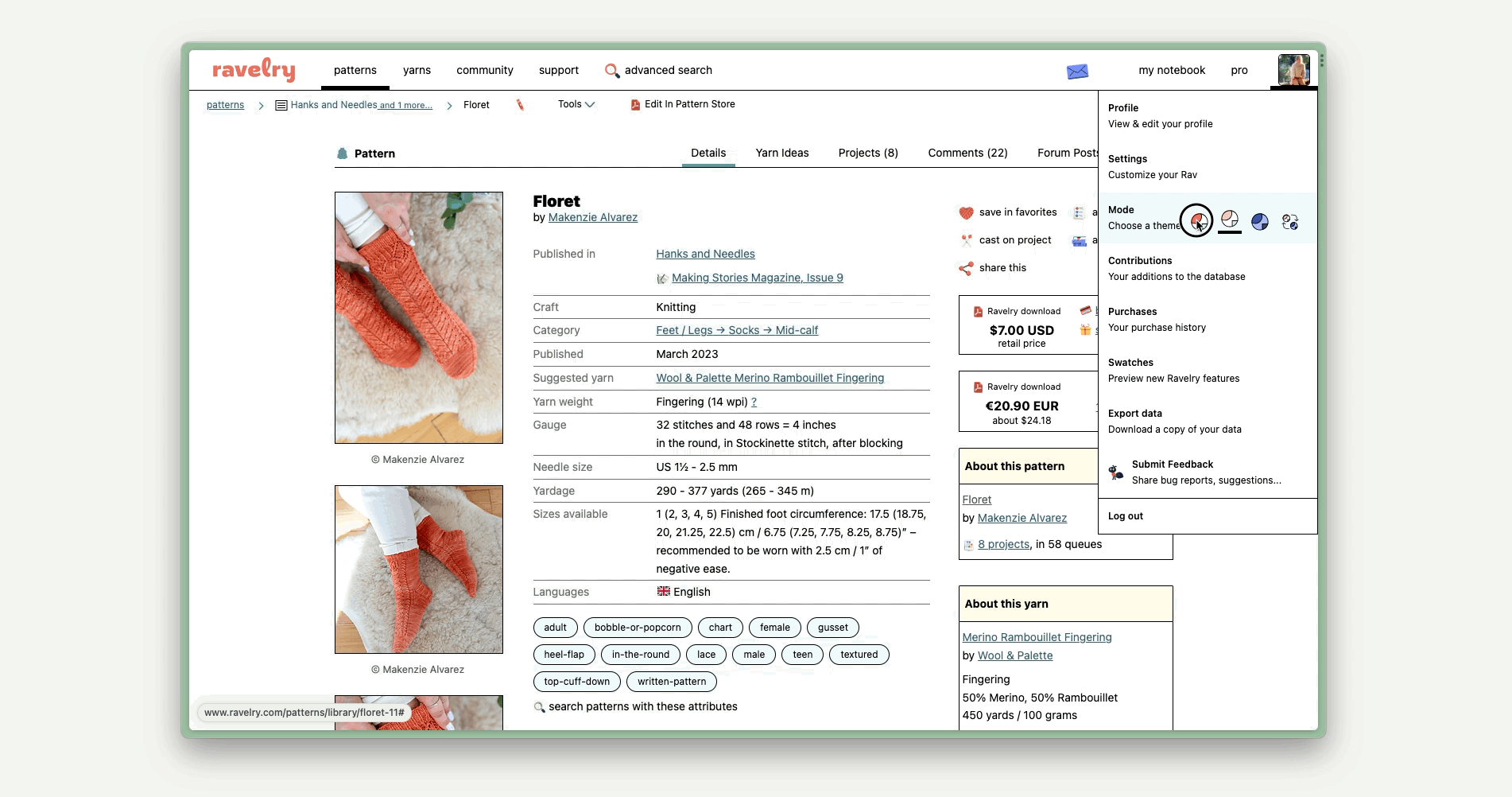
Toggling between modes on Ravelry.
Ravelry users can easily toggle between modes from their global user menu. The fourth mode option follows their operating system’s local mode settings, which is useful for those whose devices automatically switch from light to dark mode in the day and night. Ravelry will follow suit.
Our light, low-contrast, and dark modes are named Merino, Herdwick, and Balwen, respectively, after sheep breeds whose typical wool coloring correspond to the modes :)

Toggling between modes in Figma, using the native “Swap Library” feature.
Having three libraries with correlating type/color/effects styles, UI elements, and icons allows me to toggle between modes while prototyping with (basically) one click, using Figma’s native “Swap Library” feature — no plugins. It was a ton of work to set up, but now it’s easy to maintain!