Ravelry: Rebrand & Redesign
I was hired, in part, to create a Ravelry design system—but before we could do that, we needed to update the branding and visual design of the site. In keeping with Ravelry’s scrappy, homemade ethos, we created the redesign in-house. I led and executed the redesign, working closely with Ravelry’s founders.

In the early days of covid lockdown, I taught myself to use After Effects and made this animation.
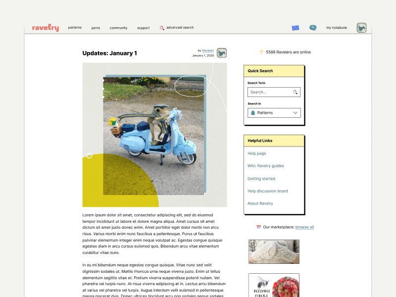
When I joined Ravelry in 2019, the branding and visual design of the site had barely changed since the site launched in 2007. Logging in was like going back in internet-time:

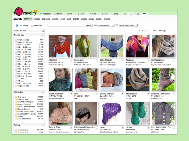

Ravelry's old branding and interface design, from 2007 - 2020
Our redesign goals were to:
Give the site a look and feel that was still quirky, homemade-looking, and a little rough around the edges; a slick, corporate, over-designed look simply wouldn’t be right for a handmade crafting community
Create a look that was flexible and timeless — we didn’t want to lean on trends that would make the site look quickly dated again
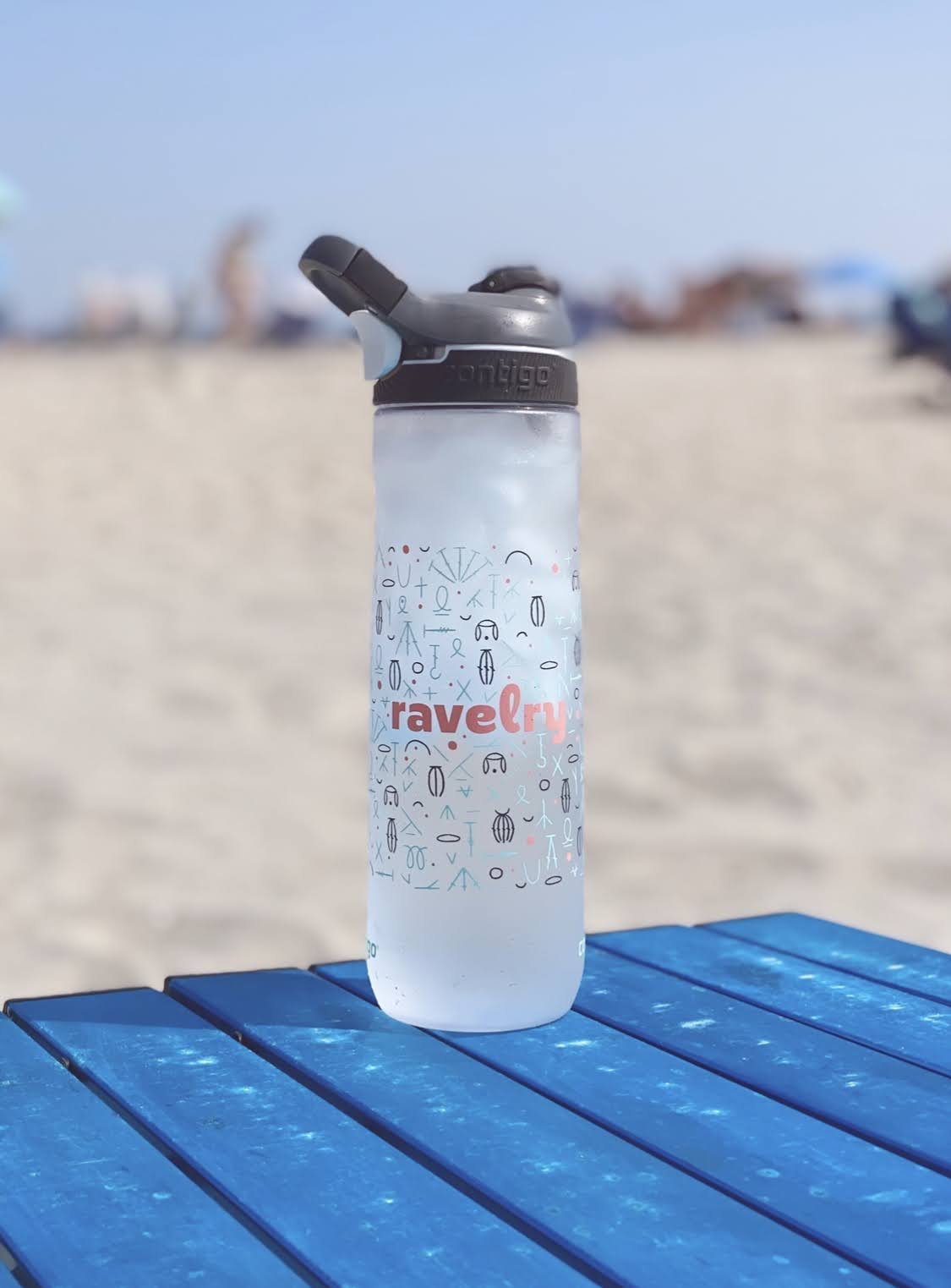
Create a logo and submark that were more scalable and adaptable than the previous one (finally, we’d be able to have the logo embroidered on gear and merch!)
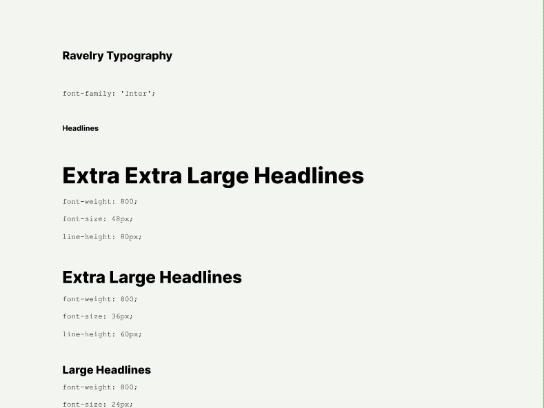
Upgrade to a variable typeface that was more adaptable for Ravelers around the globe who use the site in different languages
Reference the pink and green in the original branding, but make the site more gender-neutral
Reflect that Ravelry is friendly, reliable, and inspiring—3 words we set as our brand guideposts during the redesign process
We did a lottt of branding exploration…


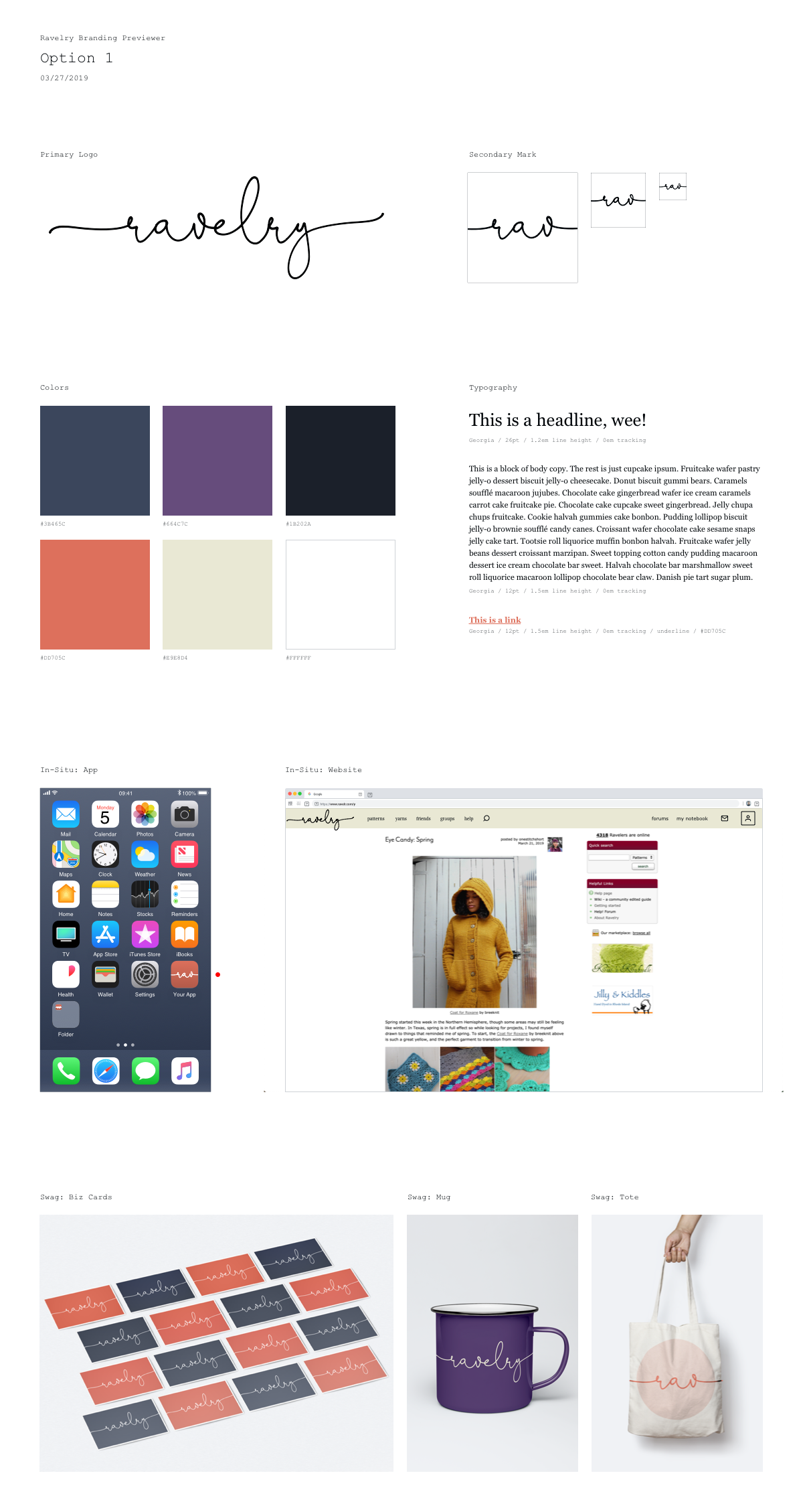

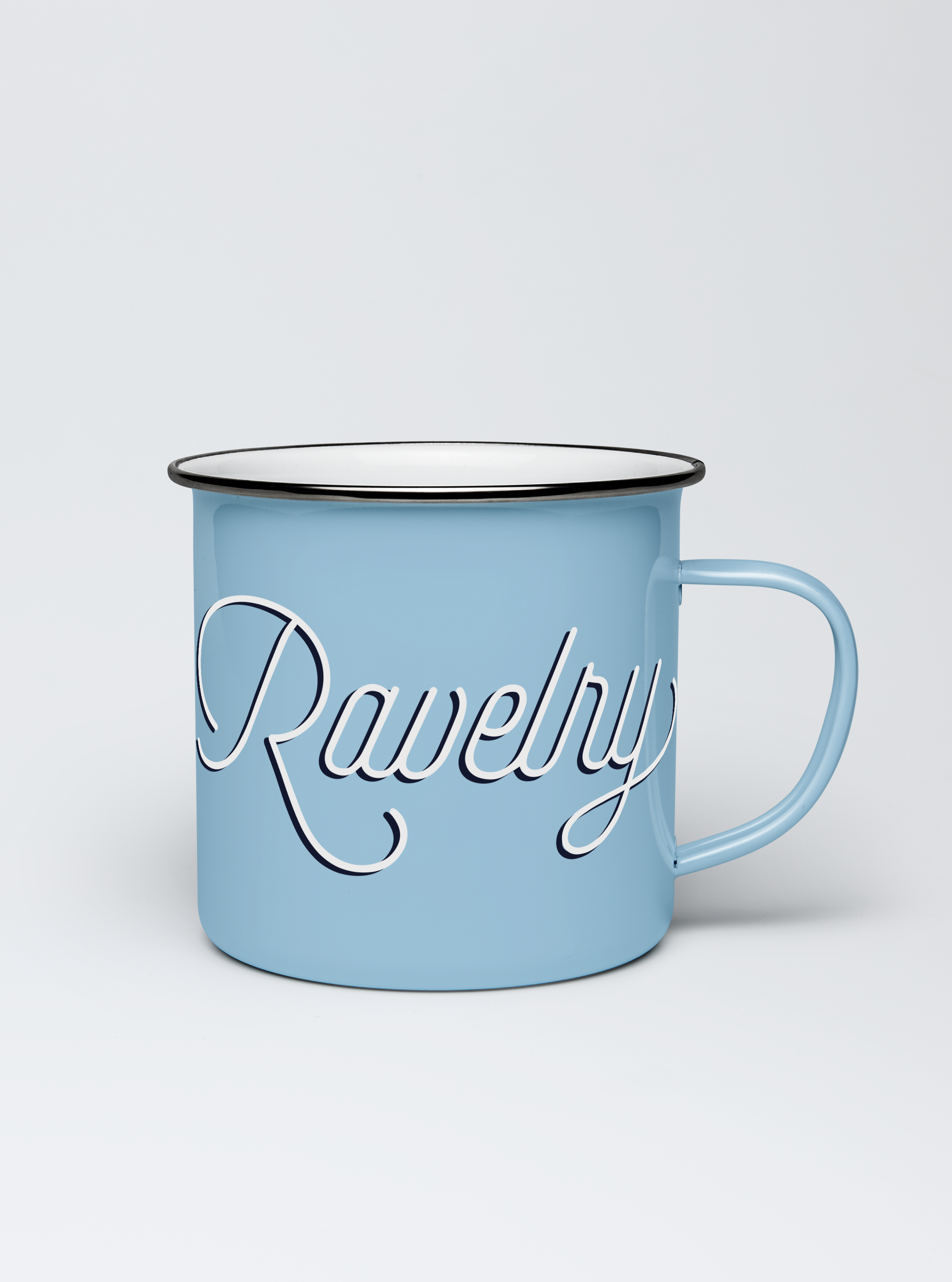
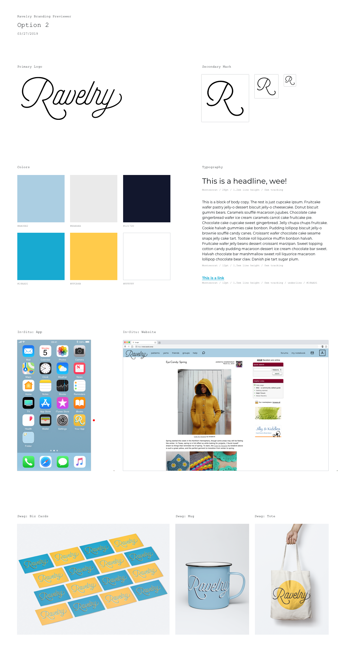

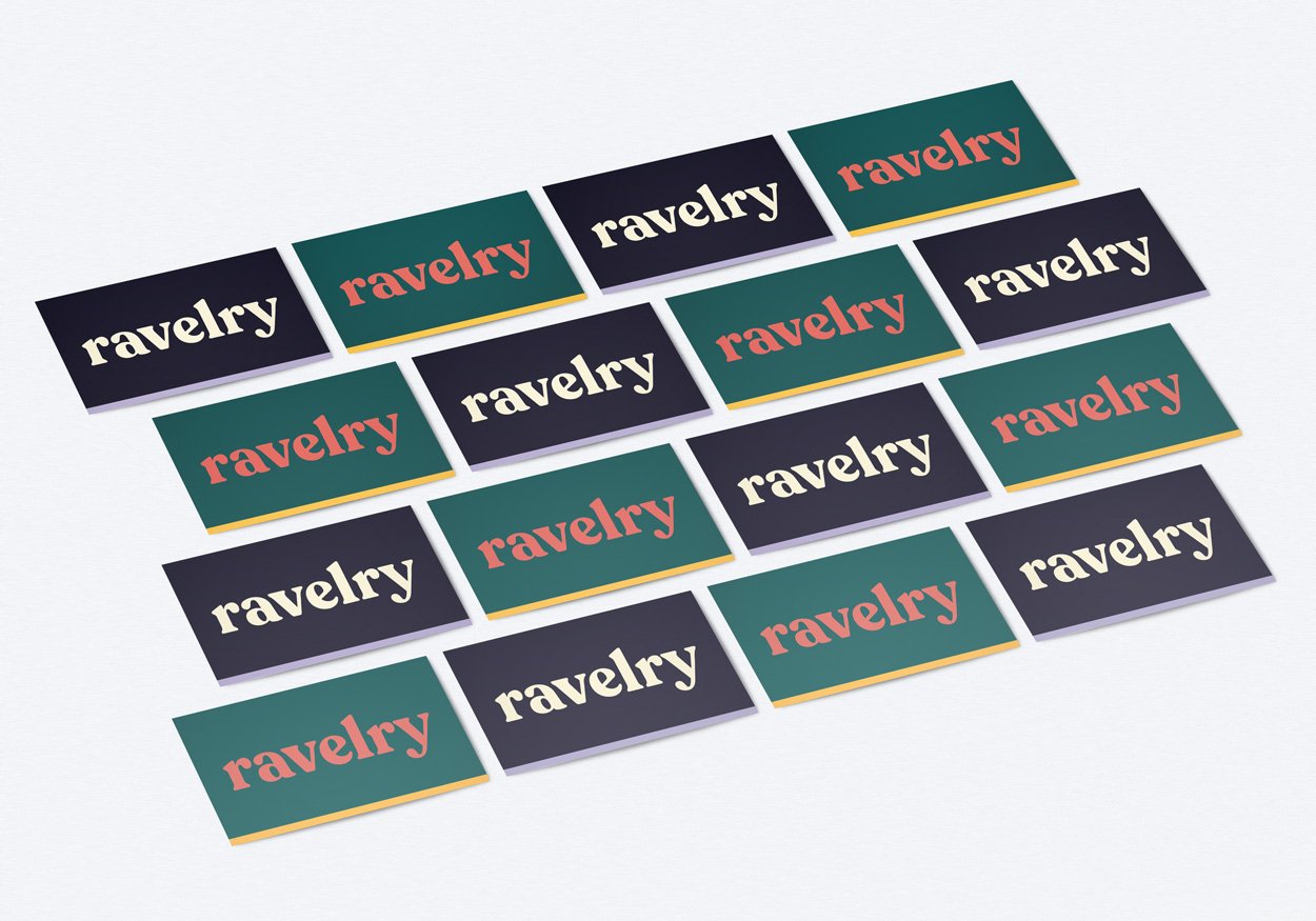


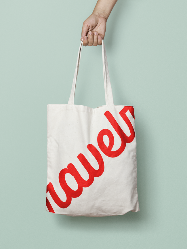
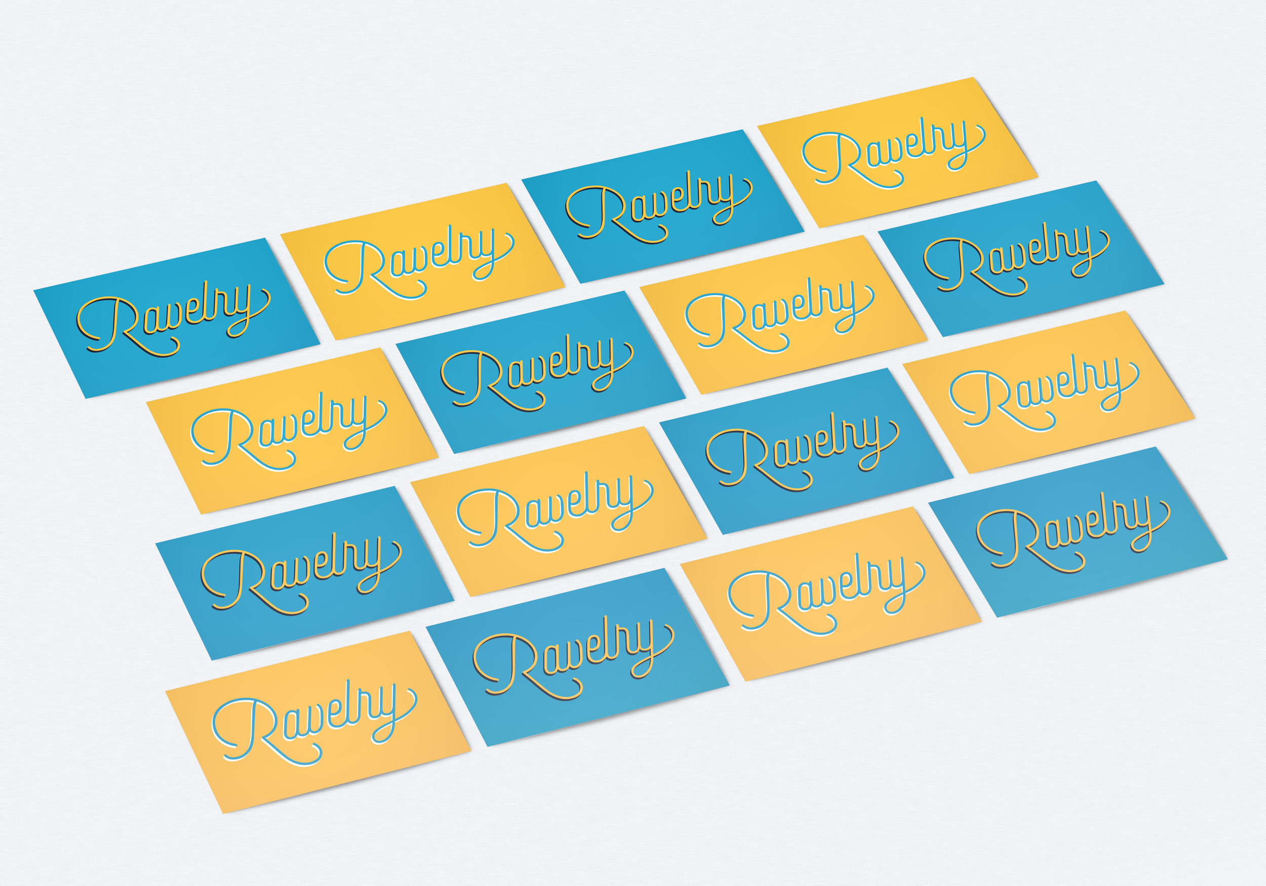

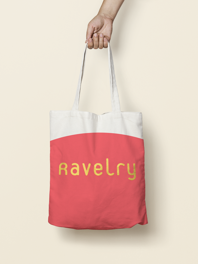


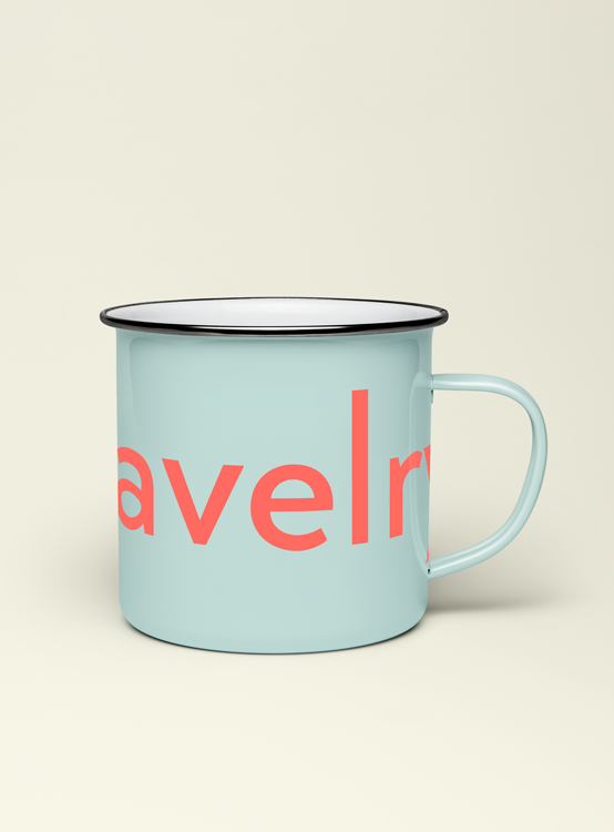


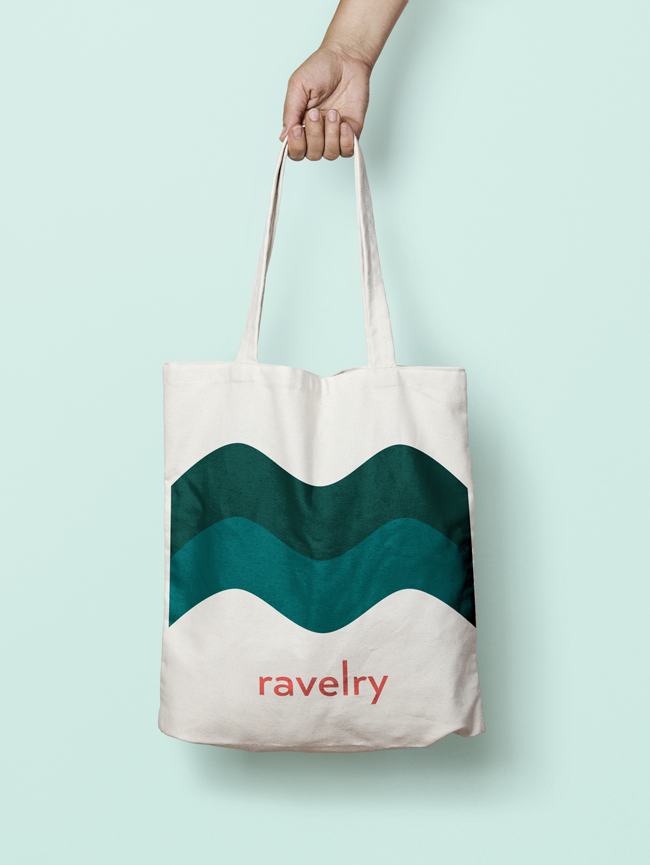


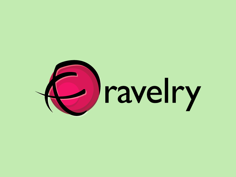
…and ultimately ended up with a new identity that we were really proud of!


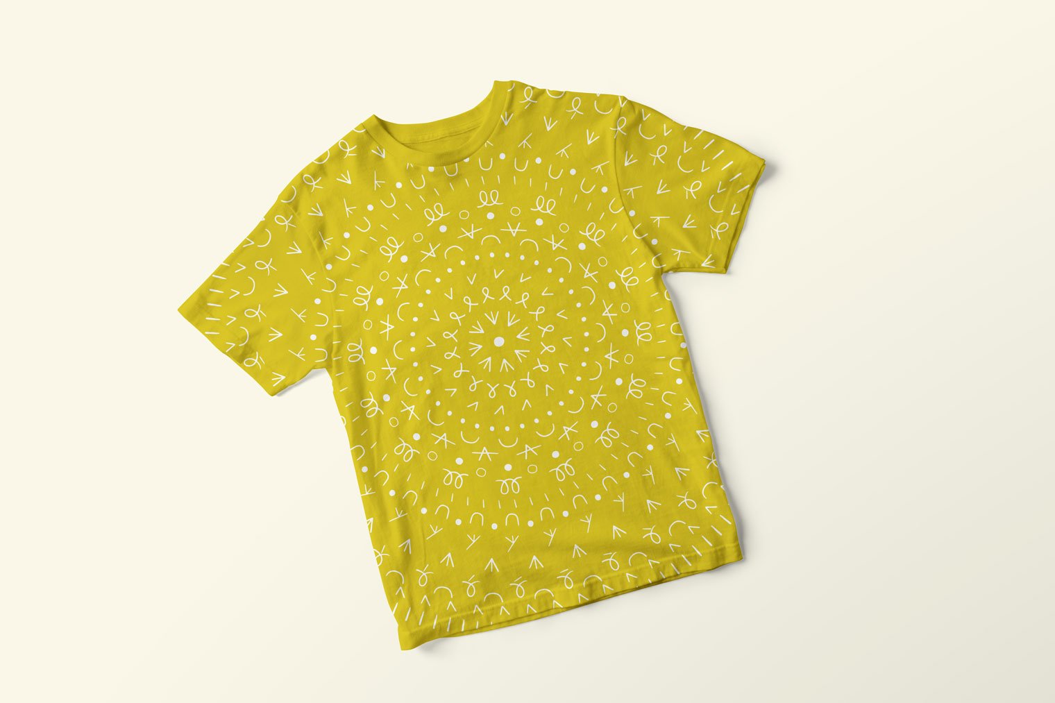
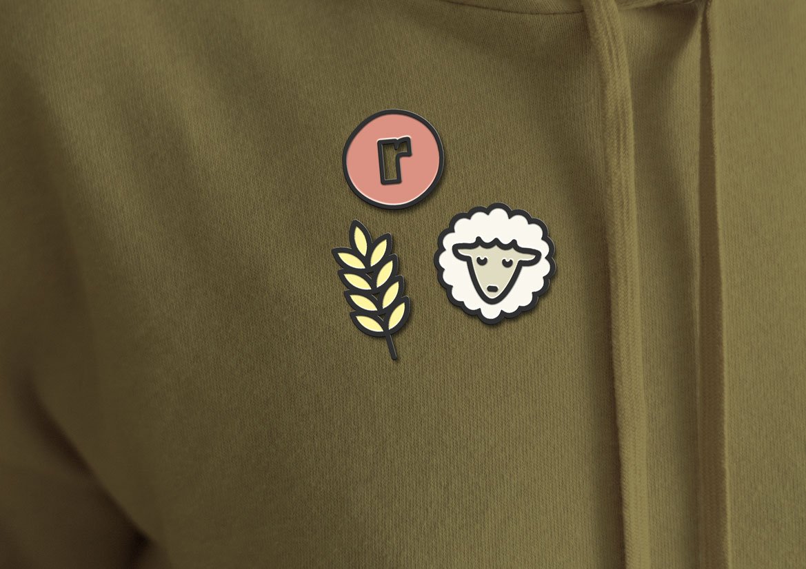
In addition to the branding design work I did, we commissioned two artists in the fiber community to create illustrations for the site. Sara Bicknell drew a series of decorate illustrations, and Kirk Wallace created an enormous library of bespoke icons. I’ve art directed several projects with outside artists during my time at Ravelry, and it’s always a delight because we’re not overly precious about “brand alignment” or “cohesion” — it’s more important for us to let artists do their thing.

Illustrations by Sara Bicknell (sarabicknell.com)
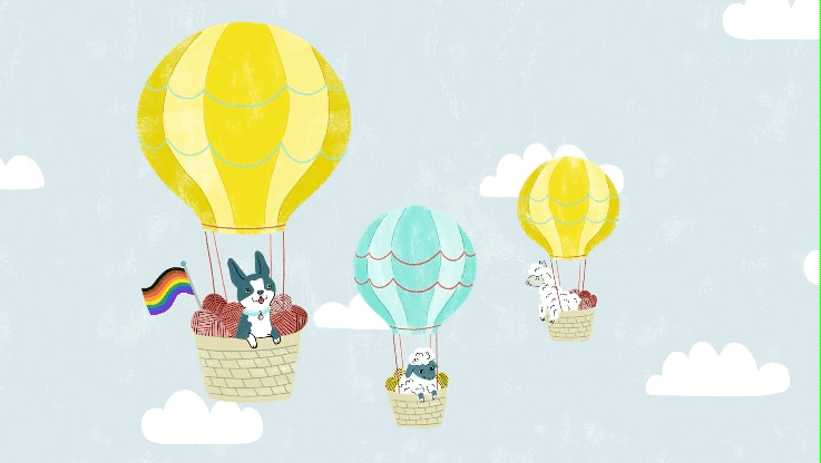
Illustrations by Sara Bicknell (sarabicknell.com)

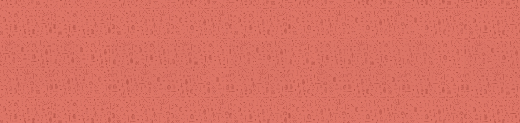
Icons by Kirk Wallace (bone.haus)

Icons by Kirk Wallace (bone.haus)
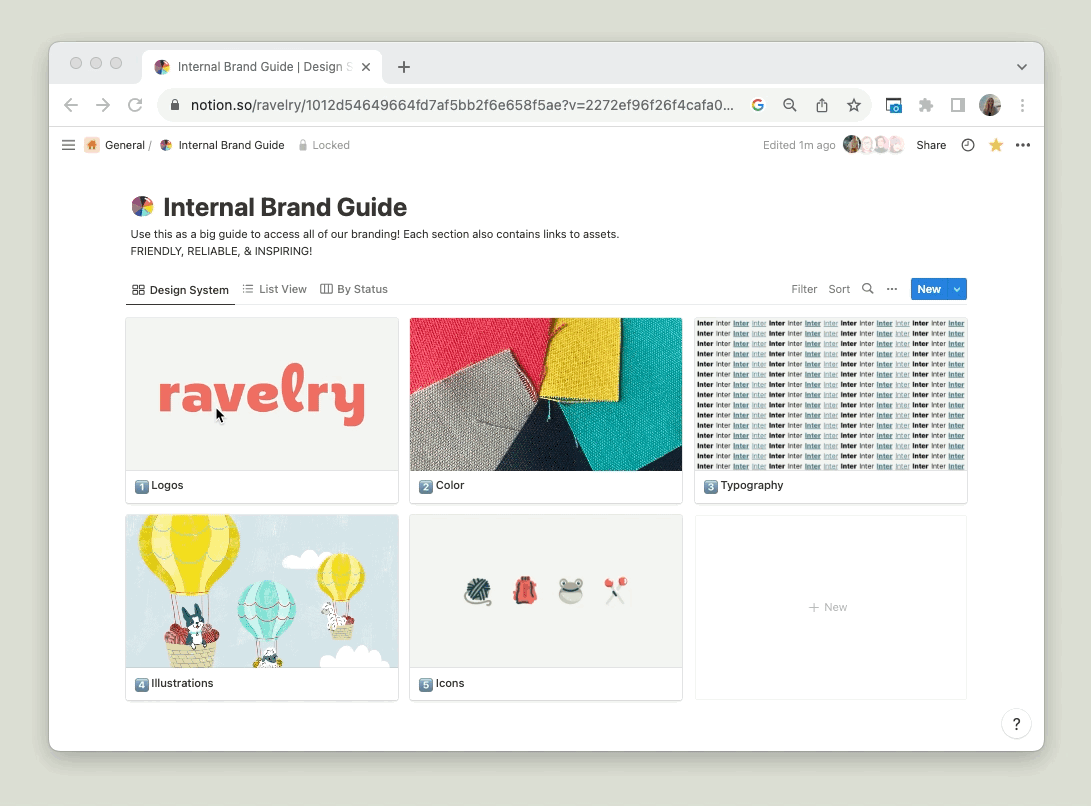
I built our brand guidelines into Notion, where they could be accessed by everyone on our team.
Several years later, we’re still very happy with the redesign. Check out Ravelry.com to see it in action, and my Merch & Social Graphics case study to see how I’ve flexed the branding over the years.